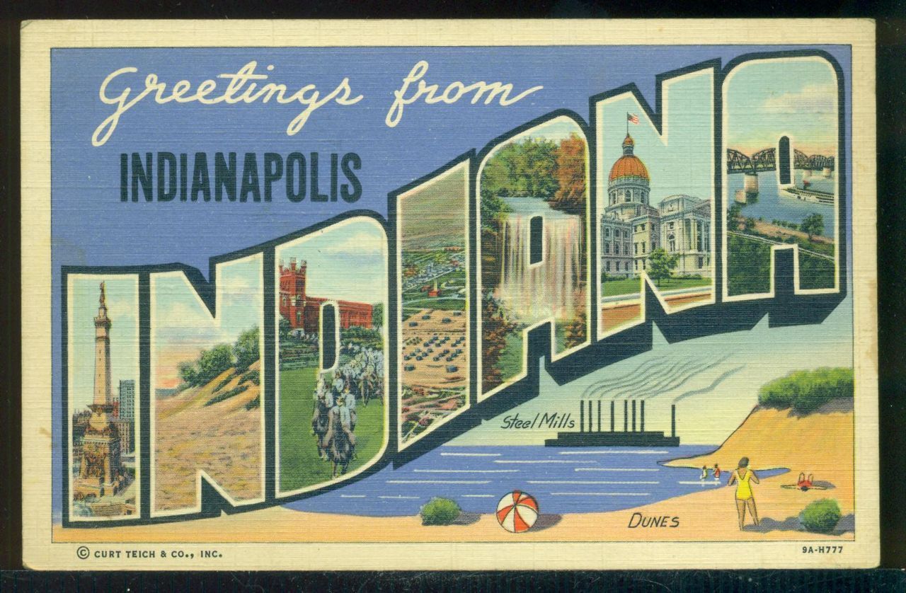
Seeing Postcard Design, Thinking Digital Design
CCCC 2014 Poster Presentation by Stephen J. McElroy
CCCC 2014 Poster Presentation by Stephen J. McElroy
Presented here is an overview of the production of picture postcards in the early twentieth century by Curt Teich & Company, a significant manufacturer and industry player during that time. Artifacts from the Curt Teich Archives in Wauconda, IL, are presented, demonstrating how black-and white photographs were transformed into visually and rhetorically vivid, full-color, ready-to-mail scenic views of Any-town, USA. Finally, suggestions are presented for how these artifacts can be used in the classroom to frame discussion about the many facets of design in the digital age.
In 1898, the US government passed the Private Mailing Card Act (PMCA), allowing privately printed postal cards that adhered to certain physical specifications to be mailed anywhere in the country for one cent—half the cost of mailing an enveloped letter. For the previous 25 years, the only postal cards that benefited from this lowered rate were those printed by the government and sold in the post office. The PMCA ushered in a golden era for postcard producers, consumers, and collectors alike, with the American public purchasing and mailing cards in the hundreds of millions--and into the billions--annually in the wake of the act.
Picture postcards often retailed for one cent apiece, making them an immensely affordable commodity and accessible means of communication in an era with few telephones, fewer radios, and no email. Postcards constituted what Kathleen Yancey has called a “thoroughly democratic genre,” facilitating a convenient and relatively instantaneous mode of communication among peoples from a wide swath of the American population. Responding to this market demand was a gluttonous supply of printed scenes and attractions from all over the country. So thorough was the visual coverage that the famous photographer Walker Evans later called picture postcards from the early twentieth century “some of the truest visual records ever made of any period” (Fortune May 1948).
Postcard producers flourished, and the most successful among them were those companies that were able to employ their production technologies and processes to recreate lifelike colors during a time when color photography was still in its infancy. Curt Teich & Company, a Chicago-based corporation eponymously founded by an immigrant German in 1898, was a pioneer of the picture postcard genre and among the most innovative--and most successful--players in the industry. In its eighty years of operation, Teich & Company created over 300,000 unique views. From a compositionist's perspective, their production methods are a fascinating testament to a compelling chapter in the the history of multimodal composing. In their heydey, the work that Teich's hired army of artists conducted to transform black and white photographs into full-color picture postcards can be divided into two main areas: alterations and coloration.
The first step in the Teich production process, as described in a 1935 manual addressed to Teich & Co. salesmen, was “the retouching of the photograph” (Sales Pointers 61). Photographs were cropped, retouched, and even altered by the artists employed by Teich in accordance with customer or salesman specifications. Teich artists removed by means of paint- or air-brush “any unsightly objects from the picture, such as telephone wires, ash cans, or signs” according to the customer’s specifications. Some alterations, which included not only removal but also addition, including physical cutting and pasting, were more liberal than others. Ralph Teich, son of Curt Teich who ran the company in its later years, recalled in a 1989 interview that
very often, a hotel located 4 or 5 or 6 blocks from the beach, wanted to pretend like they were on the beach. So it was very common, down around Miami in particular, to take a picture, and [put] in the beach right at the front door, even though the hotel was blocks from the beach. (Cochrane, 1989, p. 13)
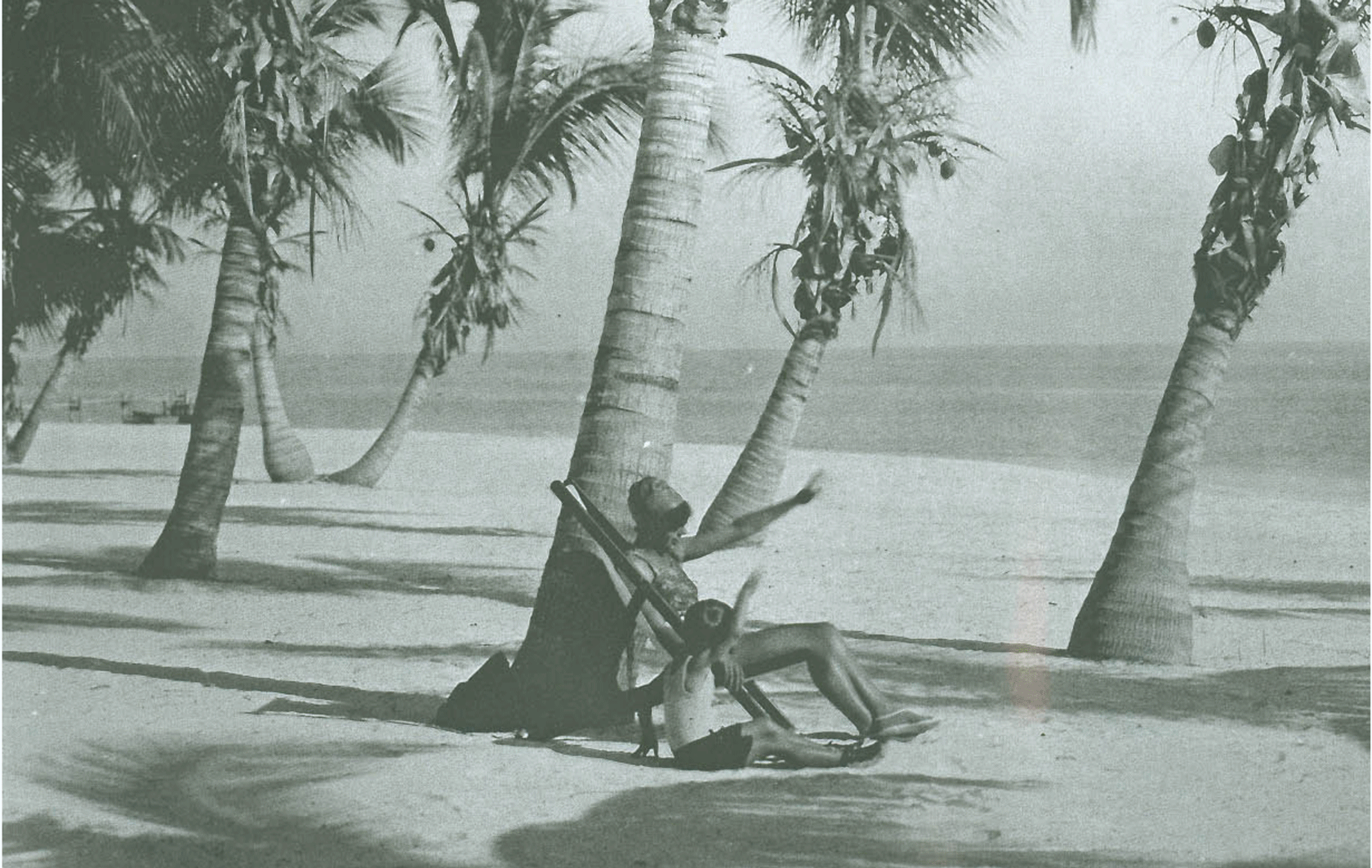
Ralph Teich called this kind of liberally altered postcard “fake photography.” In addition to hotels appearing closer to beaches than reality would dictate, scenes devised and designed by Teich artists featured a set of such alterations: beaches with women whose bodies’ shapes were altered, as in the pair of images of a Key West beach seen here; figures with faces cut-and-pasted in from other photographs, parking lots with vehicles added in; and buildings with waving American flags affixed to their roofs. In addition to the editing work that veered in to fake photography, original photographs also had to be “retouched for colors:”
in other words, a photograph which may have all the appearance of being a good clear, sharp, black-and-white photograph is not always suitable for color reproduction, and we must retouch the photograph so as to make it light where a light shade of color is required on the final card, and darken it where a dark shade of color is required. So bear in mind the fact that photographs must be retouched for color in addition to being retouched for any additions or eliminations. (Sales Pointers 61)
The editing work done by the Teich artists on the photographs was just the first step in a long process of postcard production. The next step, as outlined in “Sales Pointers,” was to set up the “composition”—that is, the copy text—for “the picture side and also for the message space on the address side” (62). Then,
a type negative must be made the proper size for the title on the picture side of the card, likewise of the type for the address side. After these negatives have been made, the key plate, that is the black plate for the picture side is made and the blue plate for [the address side] is made. A proof is then pulled from the black key plate, which is then hand colored; in other words a hand colored proof is a black proof which is hand colored by an artist to conform to the colors given with the original order. (62)
The process by which customers specified colors and artists applied them is part of the second area of production work described here.
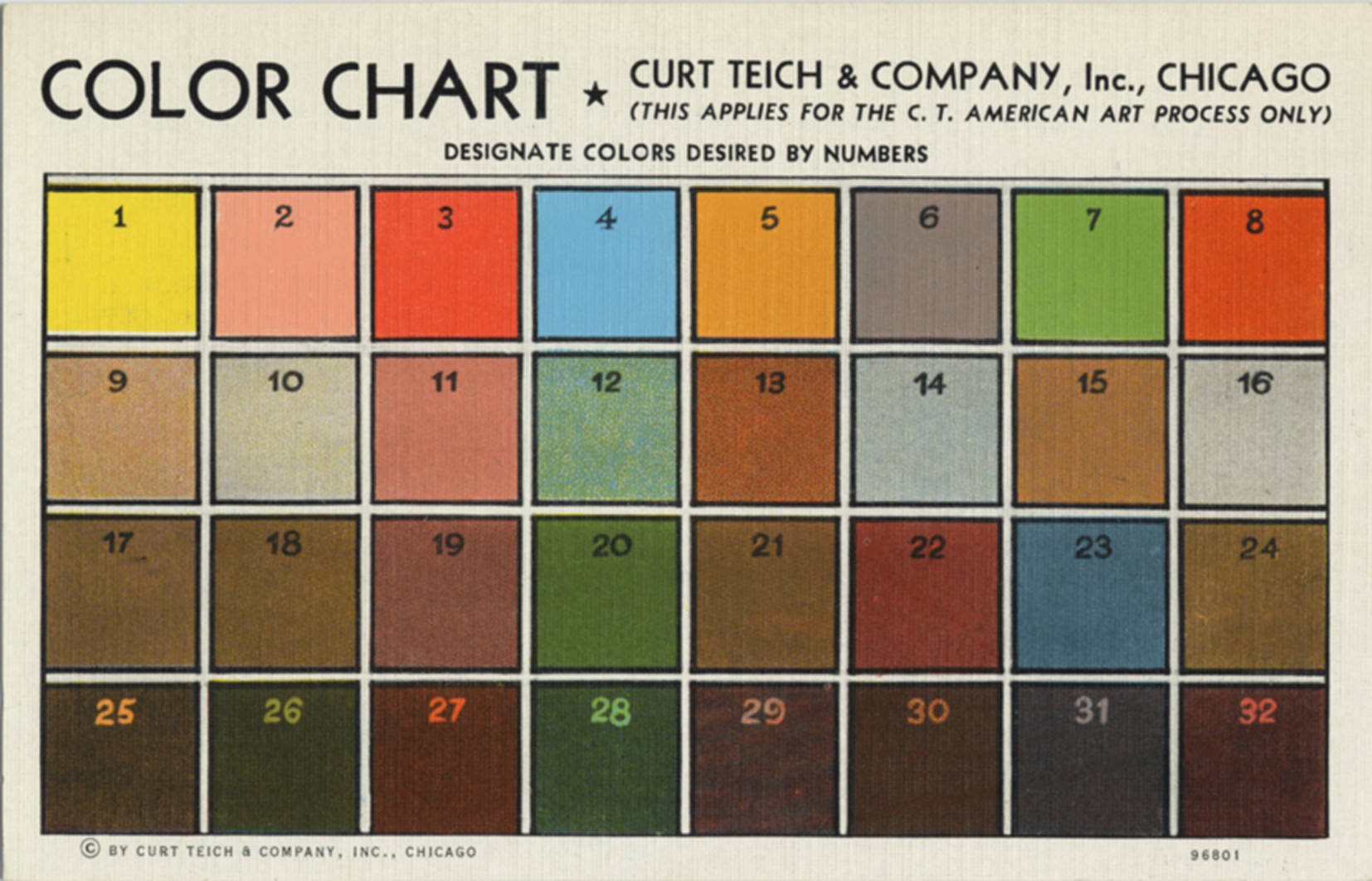
Since the photographs that formed the basis of picture postcards during this era were black and white, the color of each element in the photograph was specified by the order in a sort of color-by-number procedure. Ralph Teich described this procedure best when he wrote, in a set of notes he composed for the Curt Teich Archives, that the customer “would note all variables –for example if a tree had red leaves instead of green he would indicate it. The same for the color of the building, clothes, cars, etc. Everything that was important color wise had to be marked. Because our art department could not guess” (p. 1). These customer-authored notes were most often made by means of a sheet of tissue paper, overlaid on the photograph, that the customer would mark according to a numbered color chart—an example of which can be seen here—assigning “each individual color that he wanted with the appropriate number from the color chart” (Watkins, 1974, p. 4).
Adding color systematically to black and white photographs was a complex and time-consuming process. To begin the process, a glass plate negative was made by photographing the airbrushed/edited photograph. Five prints (one for each color) were then made and sent to the art department, where experienced artists would apply various shades of a red opaque paint to the prints to block out that color in images recorded on special negatives that would be used to produce the respective printing plates (which early on were stone, but were later copper) for each color. To “oversimplify,” wrote Ralph Teich in his notes, for a “bright yellow car, the yellow plate would be left alone[, but] the black, blue, [and] red plates would have a red tint sprayed over the car. Each artist had the break down of how to achieve each numbered color [on the chart]” (Teich, n.d., p. 3). A glass plate negative was then made for each color through a halftone screen, and those negatives were used to make the copper press plates. “After those plates are made,” reads the Sales Pointers manual, “the cards are lithographed in five colors on one side and one color on the reverse.

Examining the processes of postcard design reveals how these texts were created in response to various rhetorical situations. The cards shown here, for example, were commissioned by Key West businessman Frank Johnson, who owned a successful downtown curio store (pictured here) and hotel in the first half of the twentieth century. His direct financial interest in attracting people to his city is expressed in the scenes he chose and in the visual alterations that he requested. Johnson ordered over 50 unique views over the span of his dealings with Teich & Co.


This postcard depicts an aerieal view of the home of Ernest Hemingway. A comparison of the original photograph and a black and white printer’s proof (above, click to expand) demonstrates some of the routine visual alterations made by the Teich company. The job file instructs the artists to “remove [telephone] poles and wires.”


The Open-Air Aquarium, built under the auspices of the WPA in their efforts to revitalize the Depression-wracked Key West, opened in 1935. Johnson’s instructions to “show faintly" on the postcard "some large fish in the basins, such as baby shark and tigerfish,” indicate his entrepreneurial understanding of what people would expect to see in the aquarium both on the postcard and, if they visited, in real life.


A selection of finished postcards published by Frank Johnson.
George (Geo) Heunisch was an Orlando-based photographer and salesman for Teich & Company. He generated business for Teich over the course of four decades, beginning in the 1930s and ending in the 1960s. His involvement in the design and production of postcards on behalf of his clients began with the click of his camera and continued until the product was finished.


This depiction of Whale Harbor Bridge in the Florida Keys was photographed and color-specified by Heunisch. The images above include a scan of the edited black and white photograph together with the tissue overlay that was affixed to the photograph with tape. Heunisch's handwriting appears on the tissue, specifying colors. The job file instructs artists to "follow tissue overlay." Note the imagined catch.


Another example of a postcard whose origins lie with a Heunisch photograph and coloration specifications.


This set of images shows the design progression of a postcard folder, which would contain several other postcard views in an accordion style pull-out. Heunisch designed the folder by assembling an existing folder (as a template for size), a second postcard that was to be reproduced as the back of the folder, and a sketch on tissue paper that shows how elements should be arranged. Other images show an arrangement of pre-existing postcards that served as the basis for the folder design and a correction for the title wording and design.
These artifacts of bygone processes and their ilk can be used for approaching design in the composing classroom in a number of ways, including prompting and framing discussions and questions and also serving as a launch pad for assignments and activities.